
Last Updated on January 17, 2020 by Christopher G Mendla
A WordPress site that isn’t mobile friendly will kill your traffic. Visitors using mobile devices will bounce. Search engines (Google especially) will notice the bounces and penalize your SEO ranking. Visitors with a bad experience will not return and they will definitely not share your content.
Background
The mobile friendliness of a site is a critical SEO ranking factor today. It is also a critical factor in retaining and gaining visitors. WordPress has recently changed it’s way of handling content from a traditional editor to a block oriented editor called Gutenberg.
Gutenberg has some quirks but is rapidly being adapted by WordPress developers. The sites in question were migrated to WordPress before Gutenberg was available.
Checking the mobile friendliness of your site
This can be as easy as grabbing your phone and navigating through your site. Pay special attention to older posts if it is a blog. If it is product site or store, check older and newer products.
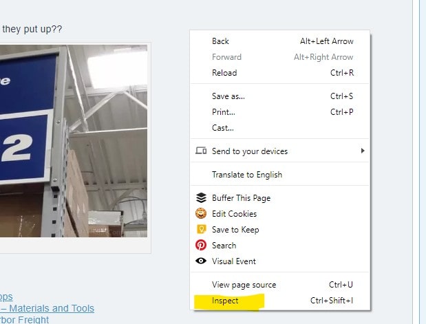
If you use Google Chrome, it is easy to simulate the user experience for a phone or tablet. Go to a page on your site and right-click. You should see a context menu with “Inspect”. Click that
That will take you to the developer’s tools. At the top left of the code panel, you should see icons that will allow you to emulate a phone or tablet. When you are in the phone mode, you will see additional icons for the phone type, resolution, zoom and rotation. Most people use their phones in a portrait mode.
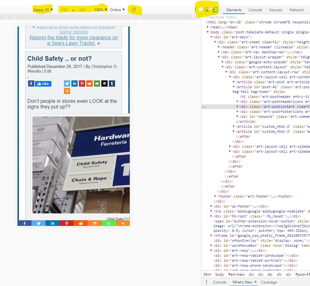
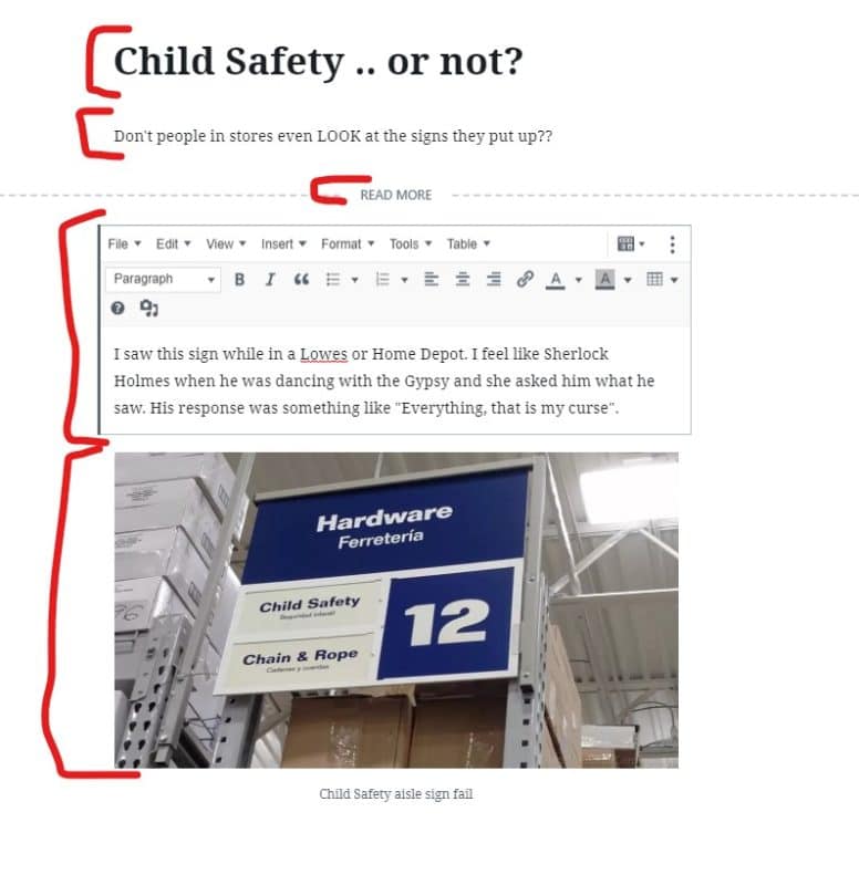
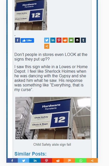
The problem
As you can see in the image above, the image in the post is cut off. It is not response (Does not automatically fit the screen). The desktop version below looked OK although when we fix the mobile friendliness, we will also improve the desktop image.
How to be mobile friendly in Gutenberg
The issue could be due to the fact that the site was imported from blogger or it could be an interaction between my template and Gutenberg. When editing the page in WordPress, you can see that the content is not in discrete blocks. The content and image are in the title and one classic paragraph block.
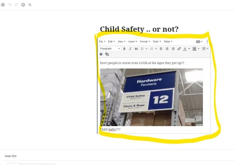
The solution for me was to do a little bit of copy and paste and break the content into several discrete Gutenberg blocks:
- Post Title
- Classic paragraph with the lead text
- A ‘read-more’ block
- Another classic paragraph with more text
- An image block.
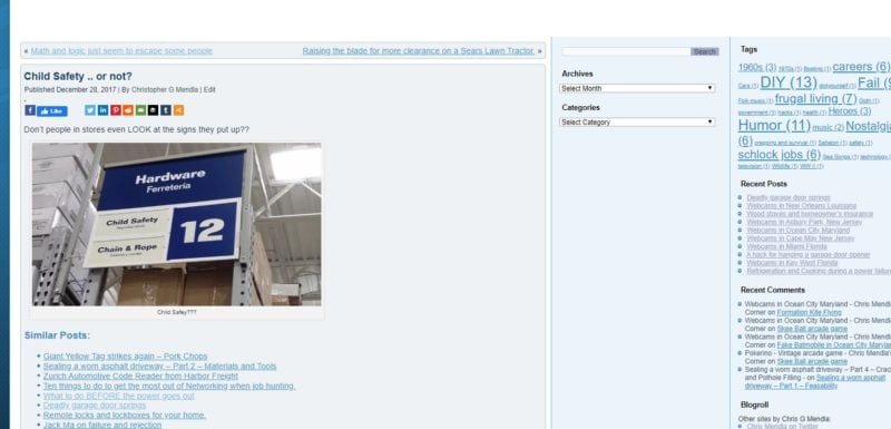
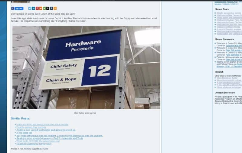
The result
The mobile issue is now resolved. The images are responsive and will fit to the screen width. That should greatly improve the bounce rate. It will also avoid visitors leaving the site after hitting the first page.
The desktop rendering was also improved as can be seen below
Summary
Regardless of if you are the site designer or you have someone develop your site, check it for mobile friendliness.
If you have issues and you are using Gutenberg with WordPress, see if breaking the content into discrete blocks helps. Fixing a site with a lot of content can be time consuming and tedious
Pro Tip – If you are fixing the posts to make them mobile friendly, it would be a great idea to tweak them and resubmit them to social media with a tool such as buffer.
The page shown as an example here is from Chrismendlascorner.com.